Research
Identity
- Colours-What types of colours they use and can they attract the audience they are looking for.
- Font-Notice and memorable font needed to keep their identity well known
- Typography-Way the text is layout and readable
- Size-Needed in different sizes but still have a memorable appearance
- Layout-How the whole entire logo is laid out
- Angle-Is it on a sloped angle and making the logo more unique and recognisable
- Taglines-Any punchy taglines to help the companies image
Purpose of an identity
- Unique labeling for companies and campaigns
- Easily recognisable
- To get a sense of what the campaign or companies is about
- Gaining awareness or popularity easily


- Big and bold writing
- Noticeable and recognisable colours
- Short and catchy tagline
- Orange and white colour scheme
- Title in capital letters while the tagline is in lower case letters
- Short title and tagline meaning people would easily remember it
- Eye catching and bright colours
- Different angle
- Patterns
The use of identities in campaigning

- This is a campaign for knife crime awareness all over the U.K
- This is recognisable by the block white writing and the picture standing emotionless in the picture
- It is used to spread awareness by its seriousness of the subject, title and images.
- The identity matches the serious of the topic of knife crime because the font is block and bold and not colourful which contrasts to the dark background.

 I will be making a campaign to raise awareness in knife crime. I believe it is important to raise awareness as recent within the news the number of people has risen massively within 2018 and it is mostly within the age range of 11-15 year olds. I hope by making a knife crime campaign I will be able to gain more awareness within my area and college. Different facts many people might not know about carrying a knife which is useful within my project and I'll be using websites quite a lot. The main purpose is to raise more awareness about the subject due to the fact that it is rising in London and we have a higher murder rate than New York at this moment in 2018. I want to be able to address a certain type of target audience who might be able to take the realisation on how serious the whole subject is and also how they might not realise that for example, carrying without use is still illegal. These news articles prove that the knife crime in England and wales have been increasing as we speak this news article was posted on the 18/10/18 and it shows the significant rise within knife crime within 2018.
Using news stories like these help social campaigns like #knifefree bring awareness of people carrying. Also, having facts that these help bring the seriousness within the subject. I believe that having the research from different websites can help the social campaign I am creating for this project as it shows real facts and statistics about knife crime and how dangerous carrying a knife is. I know by making this campaign it would have some effect on some people who will read it and I know it is not going to change the world but by making this campaign I hope that the target audience would consider something about themselves and see how it can affect all lives around them and not just their own. From previous experience dealing with this situation I know that having a website that can help people carrying or help friends and family that know people who are carrying can see what they can do and let people have the confidence to speak out about this subject or have the confidence to talk about this with someone they trust.

Ideas for social campaign
This was a plan to help me find out ideas for a social campaign that I can chose. Once I have found one I was able to make a plan and find facts that can help me with my social campaign for example the statistics and facts needed to help create awareness with knife crime within London. I can refer to this when I am starting to complete the social campaign because this has the information which can help my target audience looking at the campaign. I can refer to this on how I can gain awareness within my chosen target audience and target areas where this is more likely to happen in London.
Constructivism
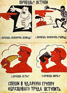 Constructivism is a belief which originated in Russia in 1913 by Vladmir Tatlin. He want "build and construct" art. This had a big effect in modern art movement in the 20th century. It had a widespread influence with massive effects on creative ideas like architecture,graphic design, fashion, theatre and industrial design. Constructivism was a particularly austere branch of abstract art founded by Vladimir Tatlin and Alexander Rodchenko in Russia around 1915.They believed art should directly reflect the modern industrial world. They were suppressed in Russia in the 1920s but was brought to the West by Naum Gabo and his brother Antoine Pevsner and has been a major influence on modern sculpture.
In 1916 she began to paint completely abstract Suprematist compositions, but the title 'Painterly Architectonics' (which she gave to many of her paintings) suggests that, even as a Suprematist, Popova was more interested in painting as a projection of material reality than as the personal expression of a metaphysical reality. Popova's superimposed planes and strong colour have the objective presence of actual space and materials.

Solomon Telingater
1910-1934
Featuring some 300 books, this is the most comprehensive exhibition ever devoted exclusively to the illustrated books made during this enormously creative period. My opinion is that it is quite messy and as my first time looking at this design it confused me because I wasn't really sure what anything was meant to be. Which does make this piece unique because you wouldn't really see many designers with these designs because usually they design their work with a certain order but with this piece they make it out like it is a collage which is a good way to express a social campaign.

Paula Scher
The Diva is Dismissed
1994
Scher’s groundbreaking identity and graphic campaign for The Public Theater in New York set a new bar for typography in the 1990s. Using unorthodox spacing, mixing font weights, and employing uncommon and historic typefaces, Scher’s poster presents information in a dynamic, expressive way. This eclectic, irreverent approach, which fuses high– and lowbrow, signals Scher’s affiliation with the postmodern, or New Wave, graphic designers of the 1980s and 1990s, who rejected modernism’s restrained aesthetic. Scher’s identity for The Public Theater places emphasis on the word “public” to position the institution as an affordable and accessible venue for all.
Quote from news article
Reputations: David King

CW: How did you become involved in designing for the Anti-Nazi League?
DK: After leaving the Sunday Times, the thing that really hit me, in 1976, was the riots and killings in Soweto. I contacted Apartheid in Practice, and ended up doing ten posters in ten days. Then the Anti-Nazi League called, and I had another week to do another ten posters. To my astonishment, they printed them in a run of 70,000, and began getting a load of publicity from the right-wing press.
Constructivist Poster

Being influence by the constuctivists art examples, I made a poster about people being able to vote who are 16 and over. I think it is important for 16+ citizens to be able to vote because they should be able to choose their future and not have people who have already had their time in school make it worse for them. I thought about having a bright colour scheme to be able to have the poster be easily recognisable and memorable. Also having the hands as a symbol for change because there is many other people who feel the same and are making petitions to help change the 18+ rule within the government.
The Promotional Mix
Advertising
A paid form of presentation and promotion by a identified sponsor of their goods and services that is non personal in which they'll exchange of a decided fee. The trader figures a way to be able to build a pull strategy through their advertisement, which the customer is encouraged to try the product to see their opinion about the produce being advertised. Using eye catching graphics of the advertised product or the service it seen by the customers to be able to make awareness of the product and make an impact of the customers decision which is all completed with the information above.
Personal Selling
One of long-established forms of promotional tools is Personal Selling. This is where the agent or salesperson visits the customer directly for example being a door to door salesperson. Face to face communication between the company's representative and the customer to be able to encourage and influence the customer decision to purchase the product or service.
Sales Promotion
Customers to have an increased sale for a limited time is a sales promotion. A short term incentive or scheme which is usually in the market at the time of festivals or end of season. Examples like vouchers, discounts or sales are some of the ways of promotion. The company focuses on short term profit ideas which can attract old and new customers to their company.
Public Relations
Trying to build a good, favorable and memorable image, the companies try to create friendly and professional relationships with the general public. They carry out their campaigns with their target to help and support people associated with it directly or indirectly. Publicity is one form of public relations which any company can use to help bring attention towards their product and company also, to help with intention to bring the newsworthy information with the public for example, helping the environment by donating money or different things to charity to make them look like a reputable company.
Direct Marketing
With help from technology, companies are able to reach to their customers without any paid medium directly. Platforms like e-mailing, text messaging and social media platforms are things the companies can use to publicise their brand and use for direct marketing. They sent emails and text messages to customers if they need to be informed about the latest offers happening within that company or brand using sales promotions schemes.
The Marketing Mix
Product
The goods and services which are offered to the consumers that pleases their desire. A company firm makes techniques to help them started and introduce products which are in high demand and lose the ones which are making the company lose money. The strategic and technically decisions are made regarding various things including variety, quality, design, features, brand name, packaging, size, returns, after-sales services and more. Products which can be presented by the firm should be able to create influence in the minds of the consumers. So that if the same product is offered by another company it can be differentiated between the companies. Which is very important and helps create brand value.
Price
This is the amount a customer pays to get the product or service being sold by the brand or company. Pricing of the product or service should keep in mind the several things before revealing the price for example, list price, competitor’s price, terms of sale, customer location, discounts and so forth. Deciding the prices, the value and utility of the product to its customers are to be considered before the company makes a final decision.
Place
This relates to the accessibility and availability of the product in the target market. How to reach the customers, discussing the best way to distribute the product because it mean better coverage of different places.
Promotion
Promotion includes different types of communication in particular, market communication. Publicising the product or service to transfer product features. The objective is to get the attention of customers and encouraging them to buy their product or service. The promotional mix implies the promotional tools used by marketers to reach the target audience. It could be Advertising, Direct marketing, Sales Promotion, Personal Selling, etc.
People
It contains of all the human beings that play an active role in offering the product or service to the customer such as the employees. It also views customers as people not as buyers, to understand their needs and satisfy them.
Process
The complete procedure and the flow of activities through which the product reaches the final consumer.
The complete procedure and the flow of activities through which the product reaches the final consumer.
Physical Environment
As the name suggests, it refers to the marketing environment wherein the interaction between customer and firm takes place.
As the name suggests, it refers to the marketing environment wherein the interaction between customer and firm takes place.
 An online virtual studio
This online virtual studio was able to show the different lighting shots. There are three different lights. Fill light, Back light and Key light. On this studio I was able to experiment on the different lights to see what went well with different types of people for instance what light would suit a white person compared to a black person or someone with lots of hair compared to someone with no hair. I was able to see the difference and how light can affect someone so easily within film and media. Learning how to use these lights can help me when dealing with clients in Unit 10 when taking pictures of different people or objects. Also with unit 12 this can help me explore how to capture images look like they can inspire or gain the target audience I have planned to make the social campaign for.
Surrealism
What is Surrealism?
A cultural movement which began in the early 1920's. Known for its visual artworks and writings, artists created startling and irrational scenes with photographic precision. They were able to make everyday objects look absurd and strange which helped enhance painting methods that allowed the still objects become alive. Its aim was to "resolve the previously contradictory conditions of dream and reality into an absolute reality, a super-reality"
Why was Surrealism used in campaigns?
 Surrealism is used to help campaigns gain more awareness in their subject. They are challenging people's perceptions of reality, which started off with artists like Salvador Dali and Rene Magritte they introduced this work within their day which was new and big. Surrealist advertisement imagery usually has a message through the advertisement as they use big and bold visuals which have the audience engaged. This proves that big, bold bright colours are a good aspect of a surrealist campaign as it is captivating, eye-catching and visually stimulating the audience watching.
Lex Drewinski

This image Lex Drewinski collaborated with the Association of Applied Graphic Designers which prepared an exhibition during the Polish EU Presidency in 2011. This is called 'Design for freedom- Freedom in Design:Polish graphic from 1981 to 2201' Tokyo and Berlin. It would appeal to an audience as it relates to current affairs with the news at that time. It challenges the reality for some people within this time period and it helps the designers bring awareness into the situation.
 Michal Batory
This advertisement was created for a dance theatre in France showing its January-Feburary addition and having different performances within the Theatre National De Chaillot which is close by the Eiffel Tower. This can appeal to an audience as the describing the dancing to be elegant and delicate like how the person is standing on eggs she would be to heavy to stand on them but this advertisement challenges the perception on reality and the viewers opinion on how the performance is out of the ordinary.
Surrealism in Advertisement
 The surreal elements are the eyes everywhere on the advertisement. Even on the glasses it can imply many things for example that everyone pretends to look and notice but nobody does. The eyes look alive and real on the background which makes it look surreal and changes reality on what we wouldn't really think it normal. This makes the audience believe on how unique the clothing brand is by having out of the ordinary clothing with eyes all over. This helps bring their target audience into the company as this shows that all eyes all are on the viewers and what they are wearing and they should be wearing in fashion clothing and Kenzo Paris is trying to show the audience that as a French Luxury Brand. This is a really positive way to show surrealism as it shows items which we normally see everyday used as something else we don't normally see and is unaccustomed to the audience lives. The only thing that I would say that is a drawback is that this advert doesn't make itself look like a clothing brand and more like an glasses wear brand and if you didn't know the brand you would really guess that this is an advert for their autumn/fall season collection.
Examples of Surrealism within my chosen social campaign

Designers and Social Issues
Tibor Kalmon

This image is representing the AIDS which was at its height during the mid-1980's where loads of people where not aware of the effects of AIDS as they had the medications for the majority of most STDs within that time period. This image is representing how people would wear more latex for fashion instead of protecting themselves from STD. I like that design of the contrasting colours. The white and black against the red background shows the seriousness of the advert and awareness. In my opinion, I believe that the designer used the female model for male gazing as in the time period contraception for females wasn't as available unlike it was for men. Which makes me believe this advert was for more of a male audience then female audience however they still wanted to address both. The text around the models figure indicates how they are trying to get to audience attention and get the audience to process that information by keeping the text around her figure it shows about how much attention she can get by dressing the way she is by random people but using her body to get the message through.

Ad Buster
This image represents Christmas shopping and how almost every family spends so much money every Christmas; when initially it is meant to be a time about spending every moment wit your loved ones. It shows how companies have many the yearly holiday into profit campaigns into spending more money for example, having boxing day sales. This proves how the companies and trying and finding ways for customers to spend more money. I feel like having this poster represent the famous world war two "Britons want you" poster brings realisation into families and how everyone buys things to prove worth and love when really they don't need to buy as much things as they do. Especially when it showing off to other families it becomes more of a competition then a holiday. I like this poster as it shows a representation of everyone during the Christmas period and how people spend loads of money for love.
Tibor Kalmon Website

I've started to make a website on Adobe Dreamweaver about Tibor Kalmon. I tried it out at first but I couldn't get the hang of the process of how the coding works. So this is my progress so far with Dreamweaver but I think I will start the website on Muse as I am able to understand and I am more comfortable using that software than Dreamweaver. I think that I need more time practicing with Dreamweaver before I start a project
Experimental Jetset

I was researching about different styles of how I can make my campaign noticeable and I was able to learn about experimental jetset and how it is used within advertisement especially in campaigns. This styles is known for using Helvetica font within most of their advertisement. I used this style and applied it to the social campaign I am researching about. I couldn't use Helvetica because it is not a font that is easily accessible so I had to use Ariel as it is the closest font to Helvetica. I believe that the message seen is easily readable and understandable. Also, adding the hashtag #knifefree will always be a reference to go to when the target audience are interested into more information about the cause. The first line represents the sharpness of the tool and how it can easily turn into self inflicted injuries. Second line represents how members of public don't report it happening and don't come forward as witness and just stand and watch. Third line represents how 1 in 5 people are witness or victims of knife crime within London and how this can impact a lot of people.

Social Messages
I was shown different types of videos of different social campaigns. I was able to analyse the videos and talk about the different effects that are being using for example, using examples of sound effects and what the message they were bringing across. Also whether it was a positive or negative impact towards the audiences views and opinions.

This Amnesty Front cover is a special edition about the gang matrix and how it affects young people within gangs. Gang matrix was launched by the Metropolitan Police. It is a database of suspected gang members in London. It is used as a risk-management tool and it helps and prevents serious violence. This magazine focuses on how it that system racially discriminates and profiles young black people and lets the viewers know their opinions of the matrix; breaking it down through figures and statistics. I think the way they have presented the information with graphs, diagrams and statistics all over the articles pages is very interesting and doesn't show all boring text on the page. The typography and font varies making the articles look interesting and eye catching. Using pull quotes and colour diagrams show how as much as it is a serious topic to talk about they still want to grab the readers attention. As it is also do to with young adults the types of colours and font they've use matches the audience they are referring to


Funding for charities
Bank loans and specialist lenders
Repayable finance refers to borrows money; the funds are available over a set period and it has to be repaid with interest. This can include loans, mortgages and social investment. This can allow community businesses to give them a start within their business but this can also lead organisations into difficulties if that group can't repay the debt due to not meeting the interest or repayment terms. This means that organisations has to be in the right shape to be able to make regular payments with good financial control. Some lenders may require security for their loan or make conditions in their loan that can constraint an organisation’s freedom to, for example, borrow money from another lender without their permission. Getting ready to take on repayable finance is known as investment readiness.
Commercial lenders are banks, if you are thinking about taking on a loan, your first port of call will be your bank, if you have one. They already know you and if you have a track record of good financial management they may be willing to consider a loan.
Social investment is the term given to repayable finance which is invested primarily for doing good. Social investors and lenders invest in projects that are expected to have both a financial return and positive social benefit to the community.
Community Shares
Community Shares are a way to raise money by offering community investors the opportunity to buy shares in your organisation. It means the investment comes from the very community which an enterprise intends to benefit.
Community Shares refers to non-transferable, withdrawable share capital that can only be issued by co-operative societies, community benefit societies and charitable community benefit societies
Offering community shares can be a great way to engage your local community, to test your idea and secure support for its ongoing development. You set the price and any limits on shareholdings, and shareholders become members of the business – often becoming loyal customers and participating in the running of the organisation and being able to elect people to the Board.
Community Shares are often used to raise finance to purchase community assets such as pubs, green spaces, community centres and to develop community energy schemes. In the last five years, there have been over 300 share offers in the U.K. that have raised over £82m from more than 100,000 supporters.
For organisations who are interested in securing this type of investment, there are two legal structure options:Community Interest Company Ltd and Community Benefit Societies and Cooperatives
Community Interest Company Ltd by Shares: a legal structure to consider if you want to provide an opportunity for private equity investment and be able to offer share capital and to pay limited dividends to investors.
Community Benefit Societies and Cooperatives: are able to make use Community Shares, enabling a community of people together to raise the money together to purchase, start-up or grow a business which benefits their community.
Grants
Grants are non-repayable funds that enable voluntary and community organisations to provide services or activities. There are over 4,000 grant funders in the UK, and the process is highly competitive. Grants are ideal for supporting research and development, building capacity or for new activities which over time could become self-financing. They are also widely used for projects and to cover the core operating costs of voluntary and community organisations such as salaries and overheads.
Short-term nature: grants rarely last longer than three years, so if you intend to your project to continue you must have a strategy for the longer term.
Specifications: many funders have specific priorities for types of activity they want to fund.
Oversubscribed funding: the total amount of grant funding received by the voluntary and community sector has fallen in recent years and is likely to fall further, coupled with more organisations looking for funding equals greater competition.
Time: it takes time to submit an application and receive a response – on average, from two to six months, depending on the funder and the scale of the grant.
Overheads: grants funders generally do not fund day-to-day running costs and it can be hard to secure the true costs of running a project from a grant-giver.
Case study-#knifefree and No Knives, Better Lives.
 #knifefree has simple identity, it shows a person who has been affected by knife crime and how he hasn’t carried a knife since 16/01/17 meaning it has nearly been two years. The use of Helvetica font is similar to the dutch design group experimental jetset . Within the advertisement as it is meant to blend in with the background of people playing football. I believe that this font is their identity which shows a serious campaign against the crime as they use white font writing and big letter which can be easily recognisable. They use their identity on bus stops, train stations, social media etc. Their adverts are very well known as the home office have broad links to post it on England and Wales advertisements. https://www.knifefree.co.uk/ is the website they use to communicate towards the public and tell them about stories of other people carrying knives and facts that are usually mislead about carrying or using a knife.
It has links to helplines and support like Fearless (crime stoppers),which is a service which lets you pass on information about a crime anonymously; Childline, who are counsellors for young people 24 hours a day to help and support with any issue they are going through; Victim Support help you if you have been affected by a crime, they can help you give you the support you need to move forward. [3] They use stories to persuade people the disadvantages of using a knife. Anecdotes can be very useful within advertisement because it can reflect on someone’s personal experience and how others may be about to relate to their story and find a way on how to deal with the situation.
 No Knives better lives, has a creative identity. Unlike #knifefree this campaign using cartoon/animation to help people in Scotland deal with the knife crime situation. They are a non-profit organisation which helps people become ambassadors within the urban and rural areas of Scotland. Their logo is quite simple as being black and white but they use Comic Sans which is known to be use for like educational purposes especially primary school children; and children from ages 10-13. They have a website with an interactive storyline which gives the audience decisions on what to do in a certain situation to do with the characters life, they are able to see the consequences of each action which can be relatable. [4] They have helplines and also the chance to become an ambassador for the campaign. The poster uses red as a connotation of blood and life as it is the main background colour of the poster this tells the audience about it being a serious topic however the use of comic sans font suggests that they are trying to reach out to younger audiences as it is known for young children at the age of 10 bring knives to school all over the UK especially one case from Birmingham. [5]
Short-term nature: grants rarely last longer than three years, so if you intend to your project to continue you must have a strategy for the longer term.
Specifications: many funders have specific priorities for types of activity they want to fund.
Oversubscribed funding: the total amount of grant funding received by the voluntary and community sector has fallen in recent years and is likely to fall further, coupled with more organisations looking for funding equals greater competition.
Time: it takes time to submit an application and receive a response – on average, from two to six months, depending on the funder and the scale of the grant.
Overheads: grants funders generally do not fund day-to-day running costs and it can be hard to secure the true costs of running a project from a grant-giver.
Case study-#knifefree and No Knives, Better Lives.
#knifefree is a social campaign made by the government to help citizens realise the dangers and consequences of carrying or using a knife. This was made because of the sudden uprising in knife crime reports happening in London in 2018. They are a public organisation who are mainly based all over London. However, it is known for helping all over the country; their main focus is London because of the sudden rise in deaths to do with knife crime in London and the amount of young people being committed for carrying or using a knife.
No Knives Better Lives is a Scottish national initiative which works with local organisations to provide information and support. The campaign aims to raise awareness of the consequences of carrying a knife and provides information on local activities and opportunities for young people. They deliver their initiative at local level. They offer training packages for anyone wanting to be an ambassador. This can be online or within training centres which are all over Scotland. Their main centre is based at YouthLink Scotland and have been placed there since 2009.
#Knifefree was started by UK’s home office in an attempt to reduce youth knife crime mainly within London but based for England and Wales. [1] They use real life cases in the campaign. They target 10-21-year olds on social media and TV channels. They were founded by the government and now they have posters and adverts on buses, bus stops and train stations. They are a non-profit organisation.
No Knives Better Lives is also a non-profit organisation, which has ambassadors all over Scotland. They have 130 Peer Educators and counting which has been working across communities in Scotland. In Scotland 41% of young people aged 10-19 are accounted for weapon offences in 2005 but in 2014 it fell to 24%. [2]

It has links to helplines and support like Fearless (crime stoppers),which is a service which lets you pass on information about a crime anonymously; Childline, who are counsellors for young people 24 hours a day to help and support with any issue they are going through; Victim Support help you if you have been affected by a crime, they can help you give you the support you need to move forward. [3] They use stories to persuade people the disadvantages of using a knife. Anecdotes can be very useful within advertisement because it can reflect on someone’s personal experience and how others may be about to relate to their story and find a way on how to deal with the situation.

#knifefree can show some stereotypical insights into what is show for example, using a black male shows the negative stereotypes within the media as more black males are being arrested within 2018 then any other. They have used real still images which show the more realistic side to the harsh reality within England and Wales. Unlike No knives,better lives which use of an animated presence to show the disadvantages of using knives. Personally, I view this to be very stereotypical as in No knives, better lives. They use a white male to portray someone being a victim however their punishment doesn’t seem as strict as someone of colour as it as viewed in the media. Also, the initiatives use people being radicalised into gangs by portraying them in tracksuits and puffer jackets hanging around council estates. I agree this happens but I think they need to also focus on people in schools. #Knifefree focuses on everyone in different situations if you hear their stories. [6]
#knifefree uses a lot of social media marketing to get their view across. They focus on social media because as it is a critical subject they need as many people as they can to see their point, from Facebook ads to video Snapchat adverts, they are trying to make a name for the campaign as well as the message they are trying to bring through. No knifes,better lives have a different approach to the way they advertise their campaign. They use a programme to help people affected or people that want to help become ambassadors for their social campaign. They use direct marketing skills to go to school, youth groups and organisations to help them spread the messages across the whole of Scotland. Working closely with those groups to help them understand the message being said throughout their direct marketing skills. Both campaigns usually give to a passive audience where the messages are more likely to be accepted which are encoded in a media text without their being a challenge. More likely to be directly affected by the messages. Some media texted are consumed by audiences when they want to be informed and educated. Newspapers, news programmes and current affairs documentaries and inform.
In summary, these knife crime campaigns are really changing lives with their work from people being affected by knife crime to helping with the families who are affected by someone who has dealt with knife crime. Overall, their media presence is very good on both campaigns and I believe have the right system into bringing awareness into the important subject.
In summary, these knife crime campaigns are really changing lives with their work from people being affected by knife crime to helping with the families who are affected by someone who has dealt with knife crime. Overall, their media presence is very good on both campaigns and I believe have the right system into bringing awareness into the important subject.
Bibliography
[1] Grierson, J. (2018). Home Office uses real-life cases in #knifefree ad campaign. [online] the Guardian. Available at: https://www.theguardian.com/uk-news/2018/mar/23/uk-ad-campaign-to-reduce-knife-features-real-life-cases [Accessed 8 Dec. 2018].
[2] Noknivesbetterlives.com. (2009). About Us | Knife Crime Prevention Scotland. [online] Available at: http://noknivesbetterlives.com/info/about-us [Accessed 9 Dec. 2018].
[3] #knifefree. (n.d.). Get help & support - #knifefree. [online] Available at: https://www.knifefree.co.uk/get-help-support/ [Accessed 5 Dec. 2018].
[4] Noknivesbetterlives.com. (n.d.). A Life Changing Decision | Knife Crime Prevention Scotland. [online] Available at: http://noknivesbetterlives.com/young-people/the-consequences/a-life-changing-decision [Accessed 8 Dec. 2018].
[5] Balloo, S. (n.d.). Boy, 10, caught with knife in Birmingham primary school. [online] birminghammail. Available at: https://www.birminghammail.co.uk/news/midlands-news/boy-10-caught-carrying-knife-14763498 [Accessed 10 Dec. 2018].
[6] #knifefree. (n.d.). Real stories - #knifefree. [online] Available at: https://www.knifefree.co.uk/real-stories/ [Accessed 13 Dec. 2018].
[7]: BBC Bitesize. (n.d.). Audience Appeal. [online] Available at: https://www.bbc.com/bitesize/guides/zg24frd/revision/3 [Accessed 7 Jan. 2019].
Comments
Post a Comment